White Birch
White Birch started with a family of NYC dentists who believed toothpaste should clean teeth, not slowly sand them down with harsh whitening ingredients. I built the brand around the real hero ingredient, trademarking White Birch and designing a bold identity inspired by the natural texture of birch bark. Over time the identity has evolved but the overall concept has stayed the same. The result: a clean, modern toothpaste line with embossed texture and premium finishes that made dentistry feel fresh, credible, and impossible to ignore on shelf.
Teeth whitening without risks.
The Challenge
When I began building the White Birch toothpaste brand for a family of NYC dentists, the goal wasn’t to create another “clean beauty” toothpaste or a minimalist tube that simply looked good on Instagram. The challenge was far more grounded in reality.
The dentists were seeing a consistent problem with the products their patients were using. Many toothpastes marketed as “whitening” relied on ingredients that were unnecessarily harsh or abrasive, slowly wearing down the enamel over time. Others were packed with additives that sounded impressive but didn’t actually support long-term oral health. And while fluoride dominates the category, there was a growing group of consumers actively looking for alternatives.
The challenge became clear: create a toothpaste that genuinely cleaned and brightened teeth without being aggressive or over-formulated.
From a branding perspective, this meant walking a very fine line. The product needed to feel credible enough to come from serious dental professionals, but it also couldn’t look like every other sterile, clinical toothpaste on the shelf. Oral care packaging tends to fall into two extremes: overly medical or overly trendy. The challenge was building something that balanced science, simplicity, and modern design without losing trust.
The Inspiration Behind The Brand
The Solution
The solution was to build a brand that felt scientifically credible, visually distinctive, and rooted in the real ingredient story, allowing the product itself to guide the identity rather than forcing a marketing narrative. As the brand grew the placement of claims changed.
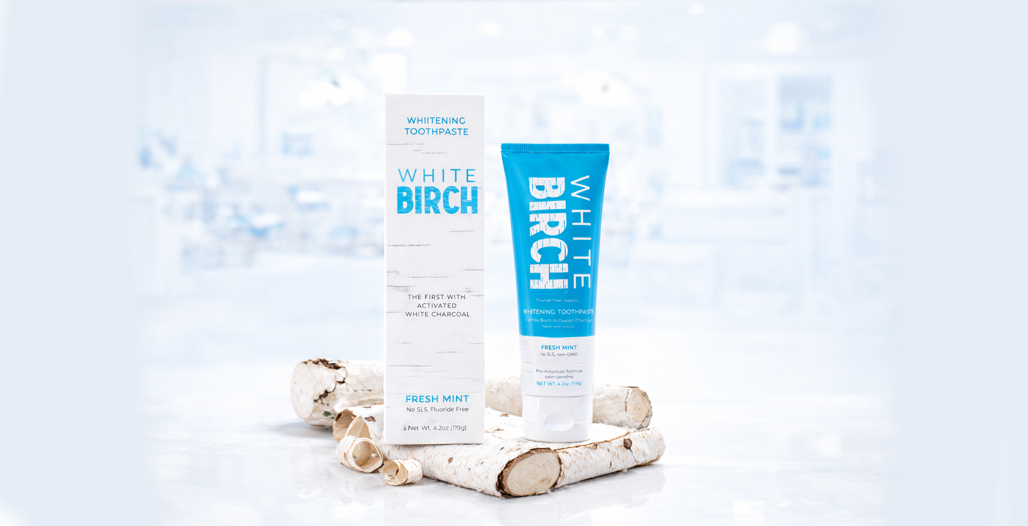
Trademarking the name White Birch to create an ownable identity tied directly to the ingredient story.
Building the brand identity around birch bark texture, giving the packaging a recognizable tactile signature.
Designing a clean blue-and-white visual system that balanced dental credibility with modern shelf presence.
Using embossed birch texture on the overall package and embossed “BIRCH” lettering to create a sensory packaging experience.
Applying matte and high-gloss print finishes strategically to give highlighted shine and matte texture in areas where things are most important.
Structuring the packaging layout to highlight key product claims clearly and confidently for retail shoppers.
Engineering the package and the Package Design so it can merchandised horizontally or vertically on the shelf.
The result was a toothpaste brand that felt like dentistry, looked modern on shelf, and communicated its ingredient story instantly — without needing to explain it.