Wicks Foods
Wicks Foods started the way many great food companies do inside a restaurant kitchen, cooking for their community. What began as dishes made for guests around the table evolved into a mission: make the same restaurant-quality products available to more people, without losing the craftsmanship that made them special in the first place. Our rebrand honors that legacy while building a modern platform that reflects what Wicks truly is today an R&D-driven culinary operation capable of creating the next generation of center-of-plate meals, appetizers, and chef-ready solutions.
Seafood Perfected.
The Challenge
Crab cakes are delicious. Frozen crab cakes? Not exactly photogenic.
Wicks had an incredible product restaurant-quality seafood items built from decades of culinary expertise but the packaging told a very different story.
The design felt dated, the structure lacked hierarchy, and the original files looked like they were assembled in Microsoft Word sometime around 1998.
The challenge wasn’t the food.
The challenge was translating the quality of what was inside the box into a modern retail presence that could compete on shelf, communicate quality and savory goodness, and finally give the brand the visual credibility it deserved.
The Inspiration Behind The Brand
The Solution
The goal wasn’t just to redesign a package. It was to restore pride to a product that deserved to be seen differently. Wicks has decades of culinary expertise and a deep heritage rooted in the Chesapeake Bay. The packaging needed to finally reflect that brand story, the craftsmanship behind the food, and the quality inside the box.
We approached the redesign with one core principle: make the product the hero and build a modern system that could scale across the entire line.
What we did:
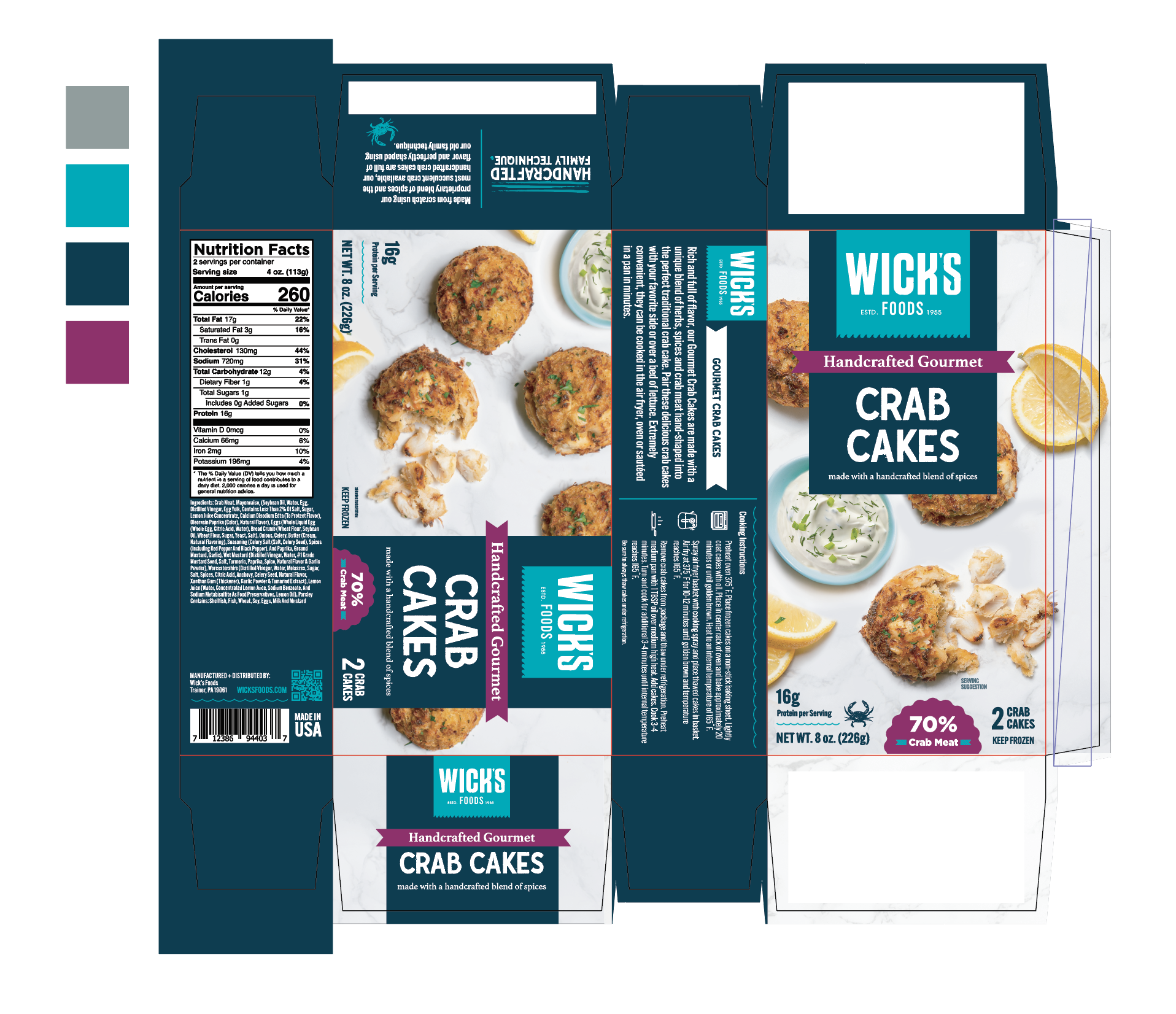
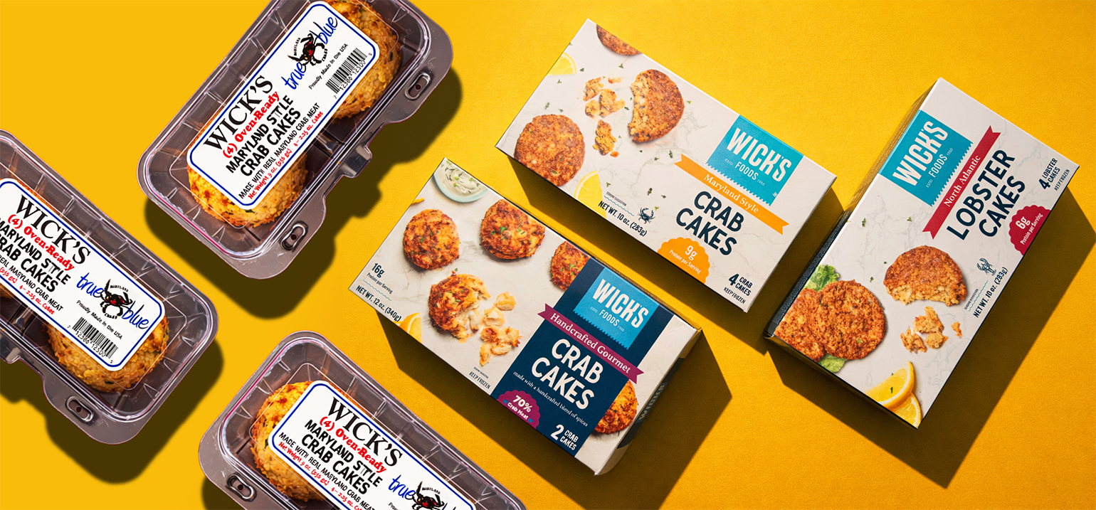
Moved from a tray format to a premium carton that allowed us to showcase the product properly on shelf and create stronger retail presence.
Introduced bold, high-quality food photography so the crab cakes themselves became the visual hero of the package.
Modernized the Wicks brand identity with cleaner typography, stronger color blocking, and a more contemporary visual system.
Created clear hierarchy across the line so shoppers can quickly understand the difference between Gourmet items and Value Add products.
Developed a blue flag PDP for the Gourmet line to highlight the product name and reinforce the premium tier.
Differentiated the Value Add line by removing the flag structure and simplifying the front panel for clarity.
Built storytelling across the side and back panels to share the brand’s origins as a a family who once served its community in their family restaurant manuy years ago.
Highlighted sourcing from the Chesapeake Bay, reinforcing authenticity and the origin of their crab meat.
Designed a scalable packaging architecture that can easily expand across future seafood products and new innovations.
The result is a modern packaging system that honors Wicks’ heritage while positioning the brand for the future. One that communicates craftsmanship, regional authenticity, and the quality of the food inside the box the moment it hits the shelf.