Fancy Food Crew
Who doesn’t love a burrito? Fancy Food Crew by Hella Dac Biet is known for its fusion of Vietnamese-inspired ingredients and classic Cali-Mex burrito craftsmanship, known for big flavor, vibrant herbs, tangy pickles, savory proteins, and zesty sauces wrapped up in a perfectly chewy flour tortilla that holds all the goodness without ever getting soggy.
Burritos Bring The Fun!
The Challenge
Our intention is always to build brands that meet the needs of their actual buyer, not just reflect the founder’s story.
Fancy Food Crew was created by an incredible chef with deep Vietnamese roots. The product itself—hand-rolled burritos—was already bold, craveable, and full of personality. The gap wasn’t the food. It was the branding.
Burritos are fun. They’re expressive. They carry a bit of attitude.
The existing system didn’t yet match that energy on shelf.
The challenge was to translate culinary credibility and cultural depth into a visual identity that felt playful, modern, and unmistakably bold without losing authenticity.
We needed to:
Spice up the brand language to reflect the flavor, sass, and confidence of the product
Introduce character-driven cues tied to each protein profile, making the lineup instantly recognizable and memorable
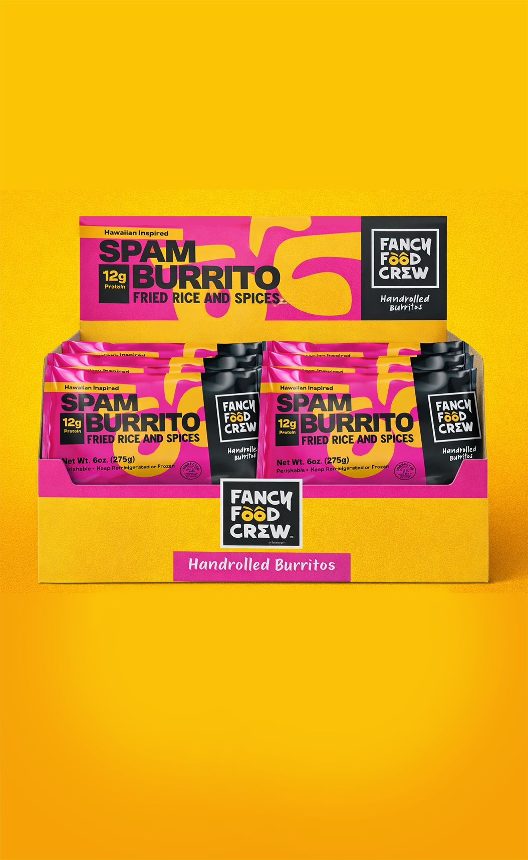
Create a scalable packaging system that could flex across SKUs, retail environments, and future line extensions
Source packaging materials that supported color saturation, shelf pop, and production realities without compromising quality or margin
Inspiration Behind The Brand
The Solution
We are always going big, because our clients are big thinkers.
Our plan was to create a brand that was fun, unapologetically bold, and instantly appealing to modern, flavor-driven consumers without losing the culinary credibility behind the product.
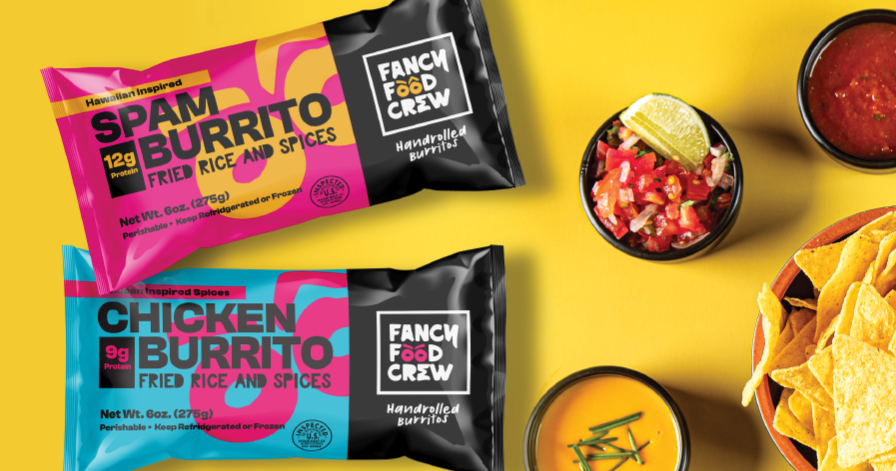
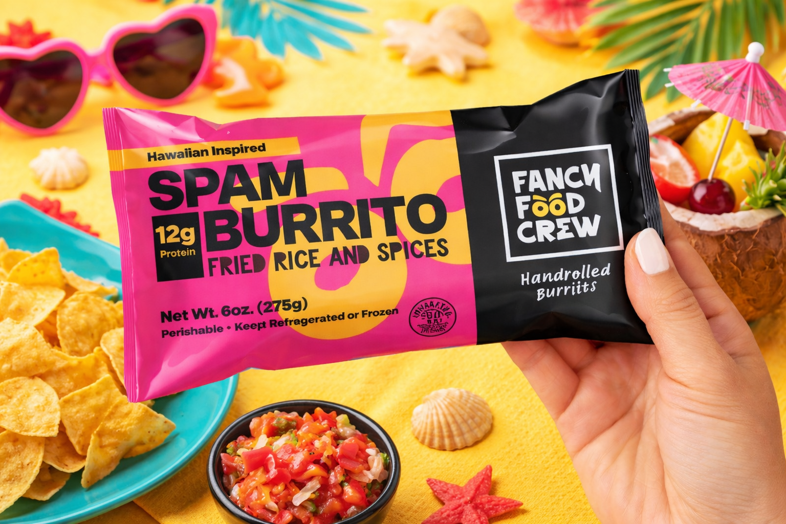
Leaned into color, contrast, and personality. Each SKU was designed to feel expressive and energetic, mirroring the experience of biting into the burrito itself.
Bold typography and high-impact color blocking ensured instant shelf recognition, while a flexible system allowed each protein to stand on its own.
To build a deeper connection and memorability, we introduced a character-forward approach tied to each protein profile, giving the lineup its own personality and making navigation effortless at retail.
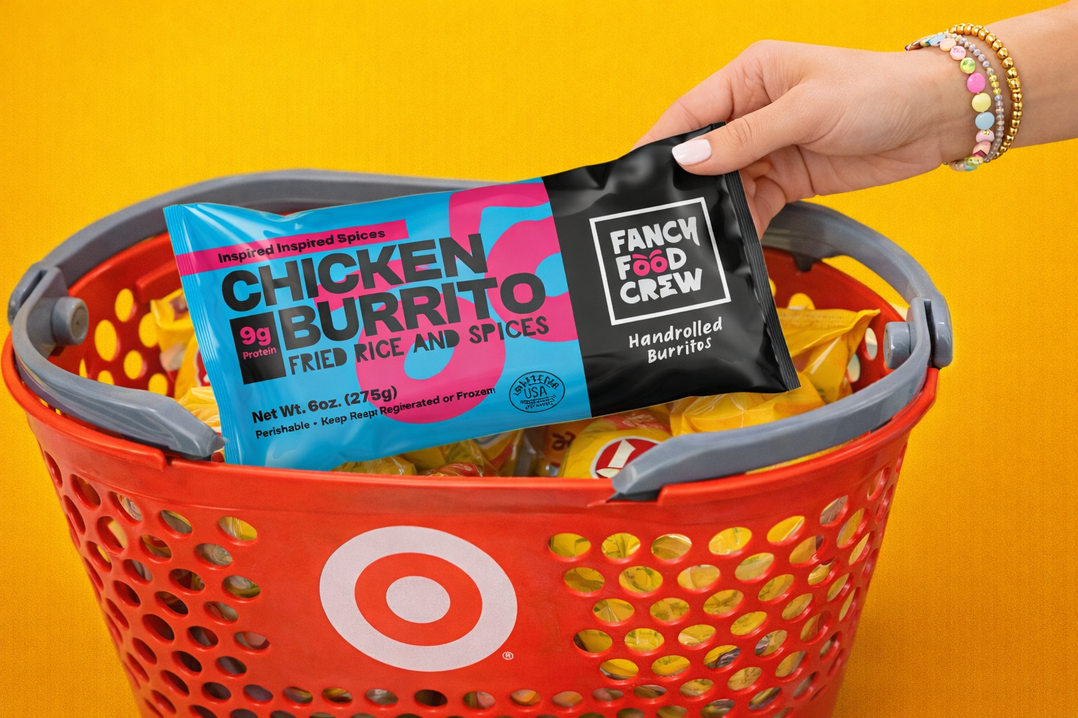
From a packaging execution standpoint, we engineered formats that worked hard in frozen high saturation materials, strong contrast under freezer lighting, and scalable display options that supported both single-serve grabs and multi-unit merchandising.
Stand Out + Perform.
The result was a brand that didn’t just show up, it performed.
One that spoke the language of its buyer, stood out in a crowded frozen aisle, and delivered the same confidence on shelf as it did on the plate.