Rastelli’s
When I started the rebrand for Rastelli’s Foods Group, Butcher Burger, I wasn’t trying to just “make it look better.” I was solving a real problem. The category had become a wall of sameness. Everything leaned into the kraft paper, butcher paper, and/or an artisan aesthetic. It was safe, predictable and easy to ignore. All I could think was, Rastelli’s is always pushing culinary innovation with bold flavors and their products are unforgettable… I want them to live up to that on the shelf!
Dominate The Meat Category.
The Challenge
Rastelli’s has always pushed culinary innovation with bold, unforgettable flavors. The packaging wasn’t living up to that reality.
The challenge was to:
Break through a category drowning in “heritage” visual noise
Reflect the confidence of a real butcher family making exceptional products
Preserve key brand equities tied to craftsmanship and rancher-sourced meat
Create a system bold enough to be remembered, not just noticed
Design packaging that could scale across boxes, trays, labels, and bags as well as other proteins and categories.
The Inspiration Behind The Brand
The Solution
That was the pivot.
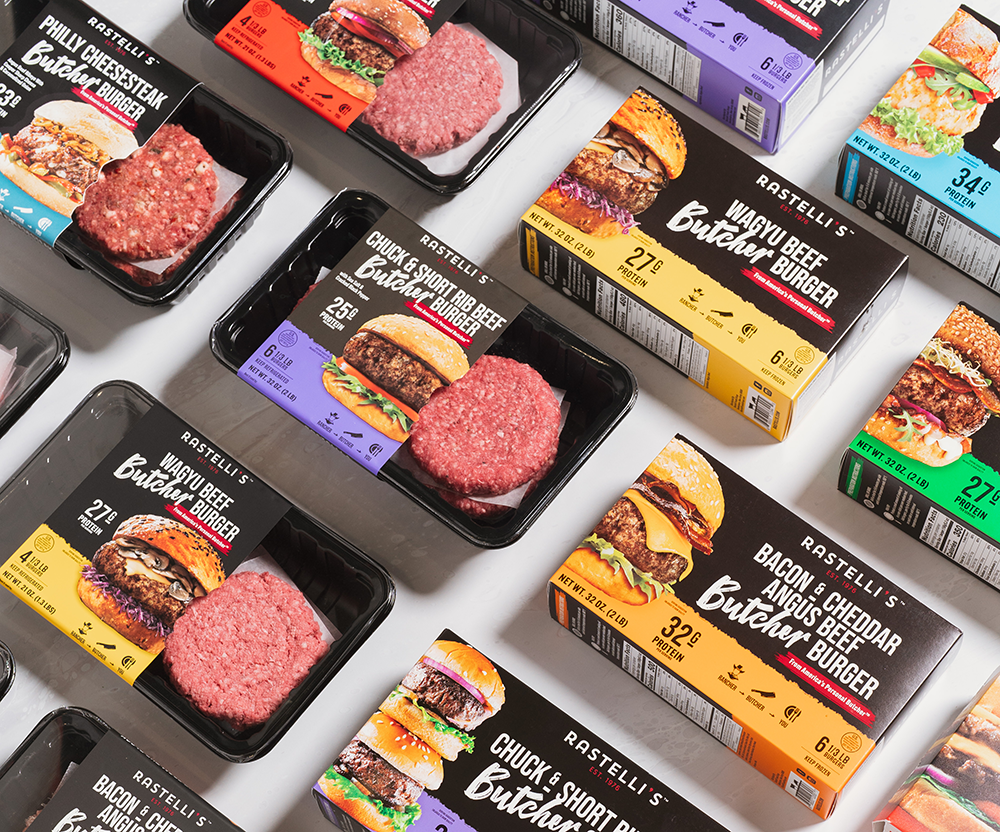
I went bold, bright color, high contrast, and craveable burger photography that didn’t whisper. The goal was simple: stop the shopper, earn the grab, and make the brand unforgettable on shelf.
I preserved critical equities from the Craft Burger line, including the iconic cow built from knives and the belief that premium meat comes from real ranchers. I reinforced that confidence with the trademarked line “From America’s Personal Butcher.” Not a tagline, a statement.
A rich black band unified every SKU. Bold base colors differentiated flavors and created clean space for USDA information, claims, and key details without competing with the food.
“Butcher” got a custom, hand-drawn font with a cleaver built into the “T,” refined until it felt intentional, not decorative.
Photography was non-negotiable. Big, tall, undeniably delicious burgers shot at a true 0-degree angle to show thickness and scale. Burger photography stayed locked in place so the protein callout could dominate instantly.
Bite-mark label cutouts revealed the product on the fresh items. Boxes were designed to merchandise vertically or horizontally.
Print finishes sealed it, embossing, spot gloss, and matte textures that pulled the eye to the food and made the package feel premium in hand.
Risky? Yes. Necessary? Absolutely!
Category Expansion
This wasn’t a refresh. It was category disruption. The rebrand now spans burgers, premium cuts, marinated meats, sauces, and more driving growth and expanding retail placement into Costco, Wegmans, Target, and beyond.
Meat domination. Executed.