Not Your Sugar Mamas
Real cacao sourced from Peru is at the heart of Not Your Sugar Mamas. As a chef, the founder, Ky Keenan, understands that organic, nutrient-dense foods are what our bodies truly crave and she chose to deliver them in their most indulgent form: chocolate! What began at farmers markets in Massachusetts was ready to expand beyond them.
Custom Mold Lots of Golds
The Challenge
Farmers markets are a great place to begin. They’re where real conversations happen. Where you meet your customer, learn what they love, what they leave behind, and what brings them back week after week.
Taking the next step into regional and national retail, beginning with Whole Foods Market, meant entering an entirely different playing field.
To grow, the brand needed to evolve beyond its farmers-market roots while staying true to its values. That meant reimagining the packaging, deepening the story and messaging, and building a relationship with a co-manufacturer that aligned with clean, conscious standards. We needed co-manufacturing partners and packaging solutions that respected both the product and the process.
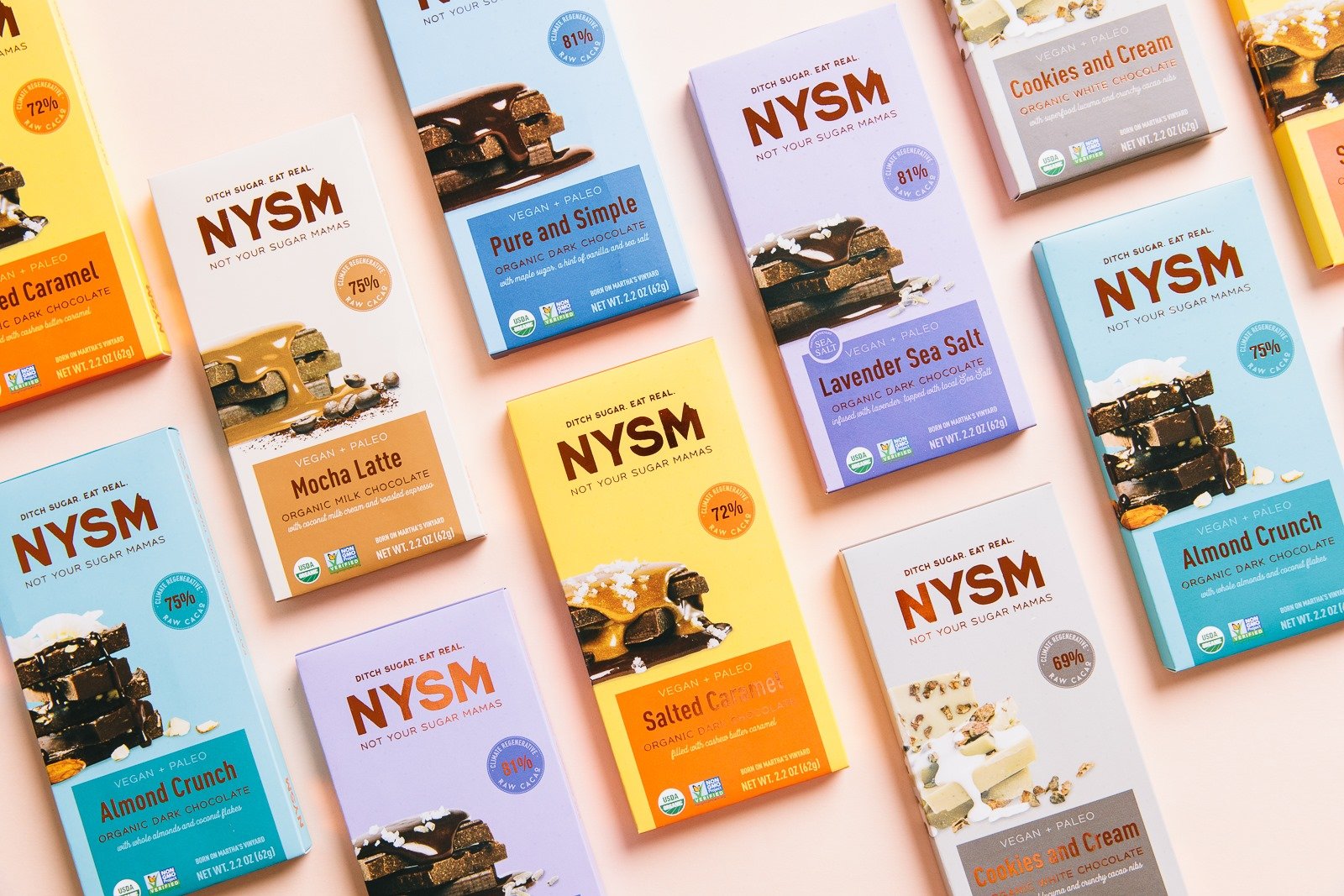
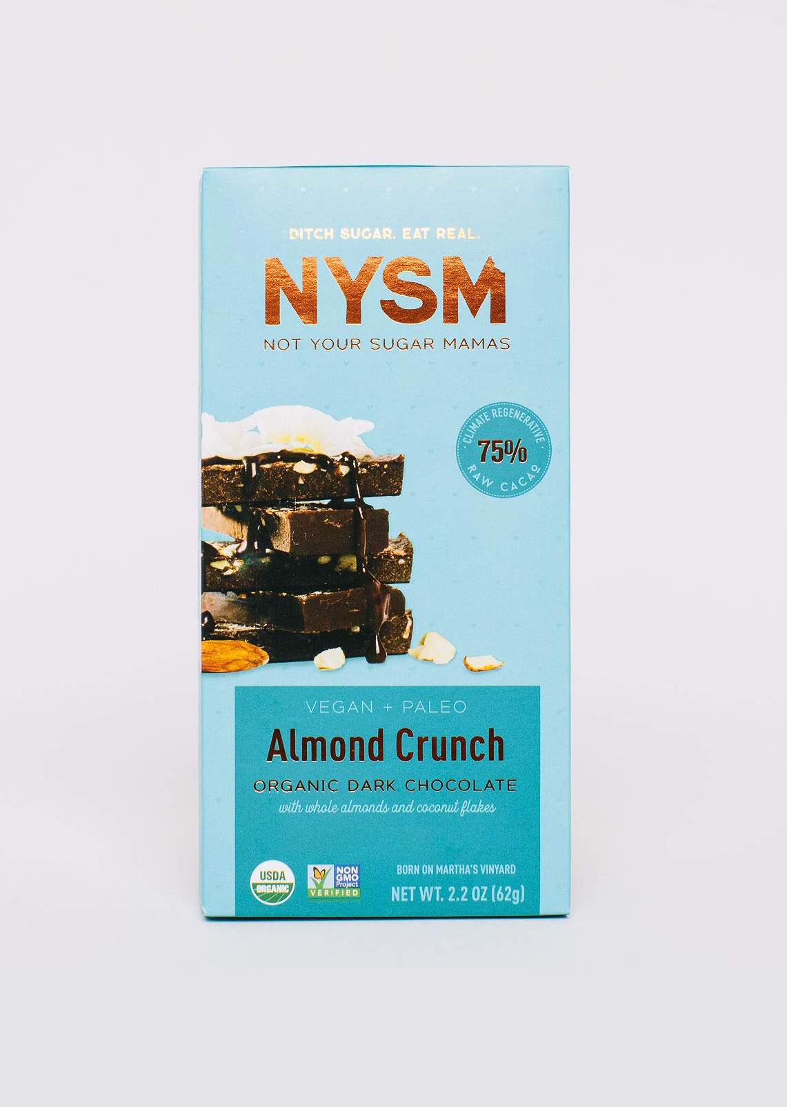
These weren’t typical chocolate bars. Each one is filled with a soft, indulgent center, then finished with a proprietary blend of nuts and sea salt. Finding partners who could honor that level of craftsmanship was essential.
Every bar is hand-wrapped, carefully placed into cartons, and packed into display-ready cases preserving the handmade feel while preparing the brand for wider shelves.
Above all, the brand had to be built to grow naturally scalable from nutrient-dense chocolate bars into future snacks, without ever losing its soul.
Inspiration Behind The Brand.
The Solution
We took the time to truly understand Ky and her deep connection to food, her intuition as a creator, and her clarity around what this brand needed to be.
From there, we moved forward the only way we know how: with intention and care.
We developed a new brand identity and messaging system rooted in authenticity one that honored the brand’s origins and its commitment to nutrient-dense, ingredients.
A fresh logo was created using the acronym, with a playful bite carved into the “M,” a subtle nod to indulgence without compromise.
We led a full week-long photoshoot, capturing the chocolate bars highlighting real ingredients, rich textures, and the signature gooey centers.
Behind the scenes, we secured a co-packer capable of scaling. One who could fill each bar and finish the backs with the proprietary blend of nuts and sea salt, without losing the handcrafted feel.
Using our trusted labeling and folding carton partners, we produced beautifully made boxes with intentional finishes that elevated the experience without overpowering it.
The packaging became a story of its own soft metallic accents printed with soy inks, purposeful callouts of cacao percentages, and photography that celebrated what’s inside. Real ingredients. Real texture. Real indulgence.
The final packaging photoshoot took on a life of its own, and we couldn’t be more proud of where this brand landed.